Sometimes, it can be hard to understand and make informed decisions in a given situation because of a lack of appropriate data. Following the recent terrible events in Japan, however, we’ve experienced the opposite problem – there is a data overload.
We’ve got rolling news reports, live video links, social media updates, satellite images, data collected from scientific organisations, articles and interviews in traditional newspaper media and many more potential information channels thrusting statistics, forecasts, images, facts, opinions, and goodness knows what else at us. But all that wealth of data doesn’t necessarily make it any easier to make informed decisions, because filtering, understanding, and making sense of that data – turning it into information is very tricky.
Anyone who’s seen the scale of destruction that’s been wrought on communities across Japan has been moved to try to do something to help. And if, like me, you’re into data and, especially spatial data, creating maps to help understand and communicate what’s been going on is, in a very small way, a positive contribution you can make.
The mapping community has been going nuts, in fact. There have been literally hundreds of different maps published over the last week displaying different aspects of the data available following the series of earthquakes in Japan. Here are some of those that I have found most interesting/informative:
1.) Geocoded Video of Approaching Tsunami in Google StreetView
This terrifying video shows a tsunami wave approaching a district of northern Japan on Friday March 11th 2011.
And here’s that exact same street intersection in Google Street View (click the picture to open fullscreen and walk around for yourself) – really brings it home, doesn’t it?

2.) Before and After Crossfade Satellite Pictures (LA Times)
I love the simple but effective slider control that the LA Times used to wipe across a set of images to compare before to after. The images represent a selection of different urban and rural landscapes and show just the magnitude of damage caused.

3.) NOAA Energy Propagation Pattern Map
Where there have been many maps that plot the individual locations of each earthquake epicenter as separate, distinct pushpins (generally based on this dataset produced by the USGS), this NOAA map is produced from a complex model of interaction between the separate earthquake events taking account of bathymetry and topography data, and plots the subsequent energy propagation throughout the Pacific. (Click for animated timeline video)

4.) Bing Maps Earthquake App
Another before/after imagery comparison, but whereas the LA Times photographs highlighted a few choice dramatic shots, the Bing Maps app lets you really see the extent of devastation, by selecting between “before” and “after” layers at any location across Japan.

5.) And As For Me?
So, with all these maps being published, what was there left for me to do? Well, as you might have noticed in some of my recent blog posts, I’m interested in using Open Street Maps as a datasource for mapping applications. The crowd-sourced model that OSM uses, where users on the ground can update data and it be reflected in the master OSM dataset within minutes is simply stunning.
What’s more, whereas most of the maps produced so far (and those I highlighted in this post) are purely retrospective, OSM can actually be used for practical, humanitarian decision-making on the ground right now. OSM actually have a humanitarian team dedicated to collecting data that might be useful following a major disaster. The free-tagging system employed by OSM allows any user with a GPS and internet connection to edit the map and provide information such as:
- roads that have been blocked (by adding the impassable=yes tag)
- buildings that have been damaged (building=collapsed)
- the extent of damaged areas (tsunami:damage=yes)
- useful amenities (amenity=phone, amenity=drinking_water, etc.)
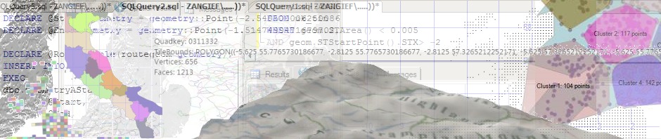
So, a few days ago I downloaded the complete OSM Japan dataset and started data-crunching, to extract those nodes and ways that could be useful to show on a post-earthquake map. Here’s an image from my dataset in SQL Server, showing an extract of the roads that are currently impassable in the Miyagi prefecture:

And here’s those roads plotted on Bing Maps:

Great, so why haven’t I published this information? Because, unlike the NOAA, or Bing, or Google, I haven’t got a wealth of processing power available to me. It took quite a few hours of CPU time to download and process the entire map of Japan to create the dataset above and, in the meantime, the underlying OSM map had received thousands of changesets. I simply can’t keep up with the rate of change in the underlying data.
OSM do produce changeset diffs so, for future updates to the map, I wouldn’t have to download the entire map again – I could simply update the differences, but I still think it would introduce too much of a delay between the raw data being downloaded and the map tiles being updated. Also, I cannot commit to keeping the map updated, and the last thing I want to do is risk introducing any further confusion to the mass of data already available by deploying a map displaying out-of-date information.
So, instead of publishing my map, I’ll be writing up the process I followed to create it in a future blog post. I’ll also be refining it and learning from it so that, if a similar situation happens in the future, either I or others will be able to react much quicker to produce a useful, practical humanitarian map for people on the ground in the affected area. I’ve also resolved to join the OSM Humanitarian Team.
In the meantime, Bing have published a map displaying the status of roads based on data collected by Honda here.